
 I have always been interested in architecture, design and things in proportion. When I became the head women’s volleyball coach at the University of Nebraska, it gave me the opportunity to exercise some of those interests.
When I was hired in 1977, the women’s collegiate program was beginning its third season. The team wore red short-sleeved mesh tops, purchased at a local sporting goods store and screened with white numbers. Volleyball uniforms made by Nike, Adidas, Mizuno, Under Armour were several years in the future.
Most collegiate teams were wore long sleeve jerseys, in part to cushion the impact of the volleyball when players passed or dug the ball on their forearms. The theory was that the long sleeves provided a more consistent surface because it mitigated the sweat that can accumulate during a match while also providing some padding when players dove for the ball.
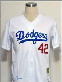
After a couple of years as a head coach I decided to design a jersey that could become a brand for Nebraska volleyball. My favorite uniforms were simple, clean and classic like The New York Yankees, the Boston Celtics and the Detroit Tigers. They were primarily two colors, with instantly identifiable lettering. But the uniform that I loved the most, the one that I thought could have the most impact for Nebraska Volleyball was the home uniform for the Los Angles Dodgers.
It was everything that epitomized first class. If the jersey were a sport sedan it would be called “alpine white.” Across the front, the name “Dodgers” was tackle twilled in bright azure blue script at slightly ascending angle until the letter “S” doubles back and underlines the name. The numerals are tackle twilled in a red or blue block lettering located halfway between the script and the belt.
By this time, Mizuno was providing both shoes and uniforms for Nebraska Volleyball. I ordered fifteen solid white jerseys, and took them to Harold’s Lettering on North 48th in Lincoln. At the time, volleyball teams were silk-screening the lettering on uniforms, but I felt that having the lettering sewn on would be a great touch that could set Nebraska Volleyball apart from everyone else.
I was somewhat startled when I discovered that Harold was unsighted when I entered his shop, but when I told him what I wanted, a jersey that simulated the Los Angeles Dodger’s home uniform, he knew exactly what I wanted and called a younger woman up to the front of the shop who took careful notes on the angle and color of the script and numerals. (Nebraska’s school colors were “scarlet and cream,” but the variations of red on Husker uniforms were a rainbow in itself. I chose a deeper red than what was currently in vogue.)
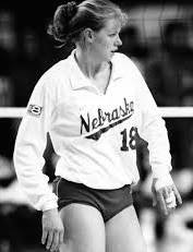
When I first saw the team wearing the new uniform, white with red script and red numerals, it was breathtaking in its beauty and simplicity. In 1986 when Nebraska played for the National Championship at the University of Pacific, a low buzz went through the crowd as the Huskers lined up in on the end line in front of 6,000 people. This was before collegiate women’s volleyball frequented television, so while people had heard of Nebraska volleyball, many people in the audience had never seen the team. Several coaches after the match told me they had never seen a more stunningly fit and striking team.
Here’s the irony to that story. Earlier that year, when I went to have our uniforms lettered I had planned on doing something different. I thought maybe we should mix things up and try something more modern. Harold greeted me as I walked through the door and this is what he said.
“You know we letter the uniforms for UCLA and North Carolina men’s basketball teams as well as many of the other top athletic programs in the country.” I nodded; somewhat surprised because I wasn’t aware this little shop on N. 48th had a national clientele. Harold continued, “But we have more requests from high school teams wanting the Nebraska Volleyball look than anything we do.”
At that moment, any ideas on changing the uniform vanished and I told Harold we would go with the same lettering, and the Nebraska Volleyball look went on to become one of the most identifiable brands of any team in any sport in the country.
One Comment
Such a cool story…who knew? We were a strikingly stunning team in ‘86????